Redesigning a premium digital experience
Elevated a luxury brand in real estate through editorial design, motion, and scalable systems.
Concord London is a luxury property developer known for high-end residential projects.
Following a recent brand overhaul, their digital presence no longer reflected their positioning in the market. This project focused on redesigning their website to align with the new brand identity while creating a modern, premium experience that could compete with top-tier developers.
How might we elevate Concord London's website to reflect its luxury positioning, while making it easier for users to learn more about its developments?
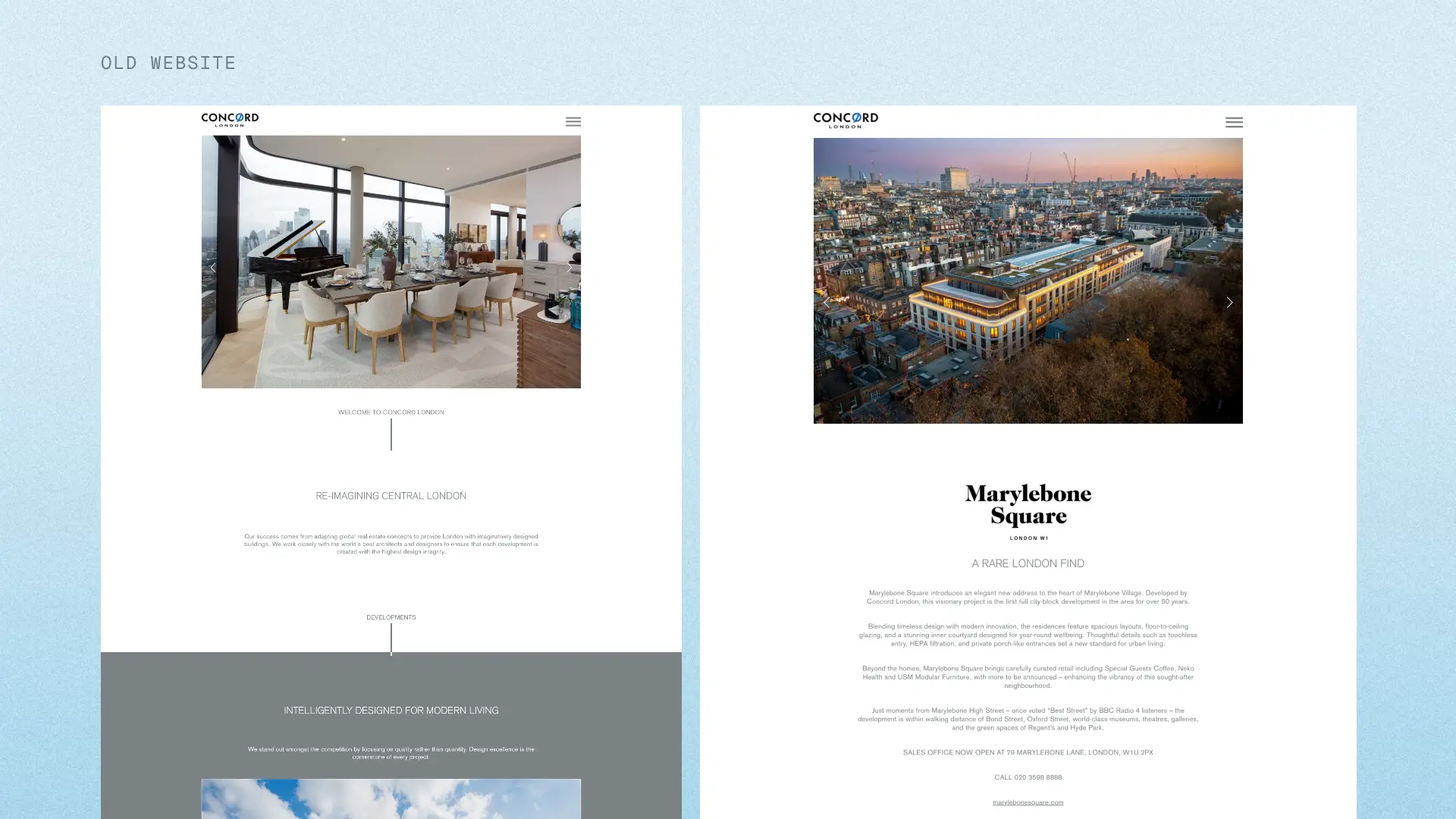
The existing website was no longer serving the brand or the business:
- Visual design felt outdated and did not reflect a luxury offering
- The experience lacked emotional impact and storytelling
- Lack of navigation made it difficult to explore projects
- Competitors were delivering more immersive, editorial-style experiences
As a result, the website underperformed as both a marketing tool and a brand touchpoint.
Initial Insights
Target audience and personas
To ensure the experience aligned with both brand positioning and business goals, I defined a high-level view of the target audience.
Primary audience:
- Affluent homeowners and investors seeking premium residential properties
- High-income individuals with strong expectations for quality, design, and service
- Often evaluating multiple developments across different developers
Secondary audience:
- International buyers and investors
- Real estate agents and partners browsing on behalf of clients
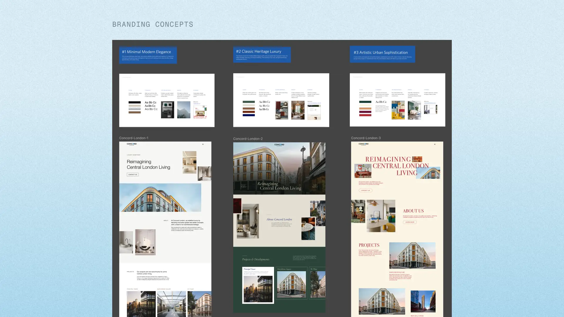
Supporting brand direction through rapid prototyping
To support the marketing team and reduce ambiguity early on, I worked in parallel across branding exploration, audits, and research.
While the brand direction was still being defined, I created quick visual explorations for each proposed direction. These were used by stakeholders to evaluate and align on the final branding.
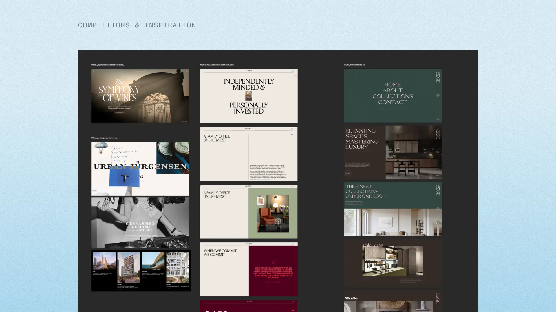
Competitive benchmarking
I analyzed competitor websites in the luxury real estate space to identify patterns and opportunities. This set the bar for what "premium" needed to feel like digitally.
Key Insights
Strong use of large, full-bleed imagery and video
Editorial and magazine style layouts to tell stories
Subtle, high quality motion and transitions
Clear project discovery pathways
Website audit
I conducted a full audit of the existing site and identified key issues:
Navigation & Informational Architecture
Difficult to browse and compare projects. No clear hierarchy between content.
Content & Storytelling
Content felt flat and overly transactional. Lack of narrative around lifestyle, location and brand.
Visual Design
Lacking and does not reflect luxury positioning.
Conversion Gaps
Weak CTAs and static experience resulted in low engagement.
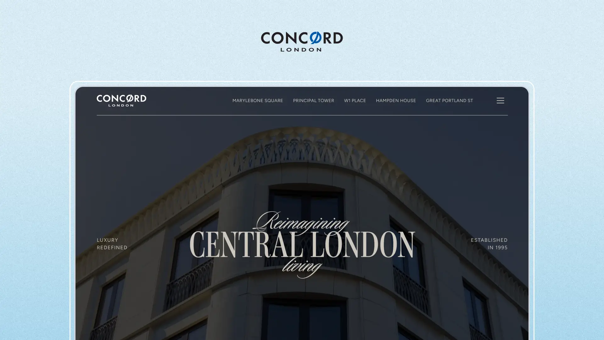
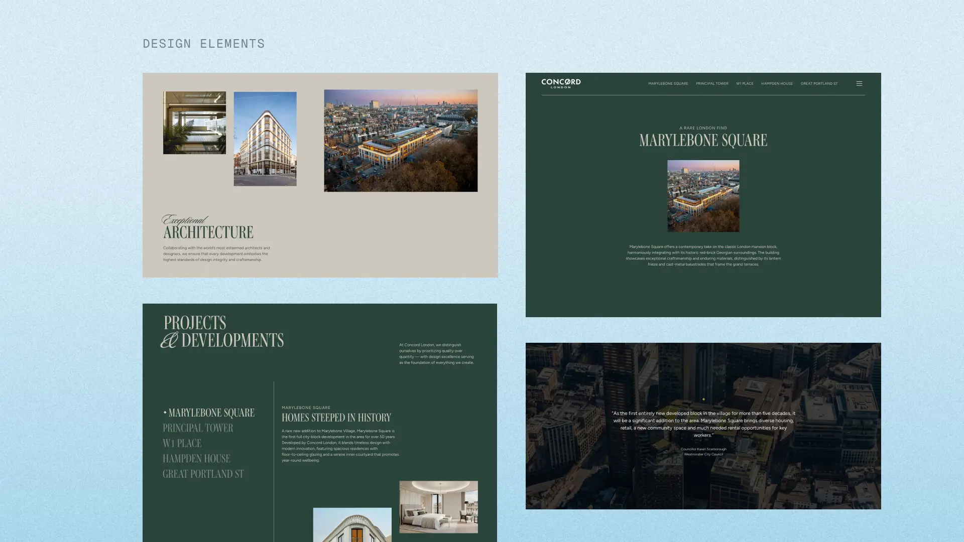
Designing for a luxury experience
Key design elements
The core goal was to translate "luxury" into a digital experience by using:
- Editorial layouts inspired by high-end magazines
- Large-scale typography and imagery to create impact
- Subtle transitions and scroll-based animations were used intentionally to enhance experience
- Whitespace and pacing to elevate perceived value
Using AI to accelerate exploration and alignment
To move quickly under tight timelines, I used tools like Lovable to rapidly prototype interaction patterns and test animation concepts. I also used this to provide a realistic, tangible example to stakeholders. This approach improved feeback quality, reduced ambiguity in discussions and helps stakeholders react to real experiences instead of static mockups.
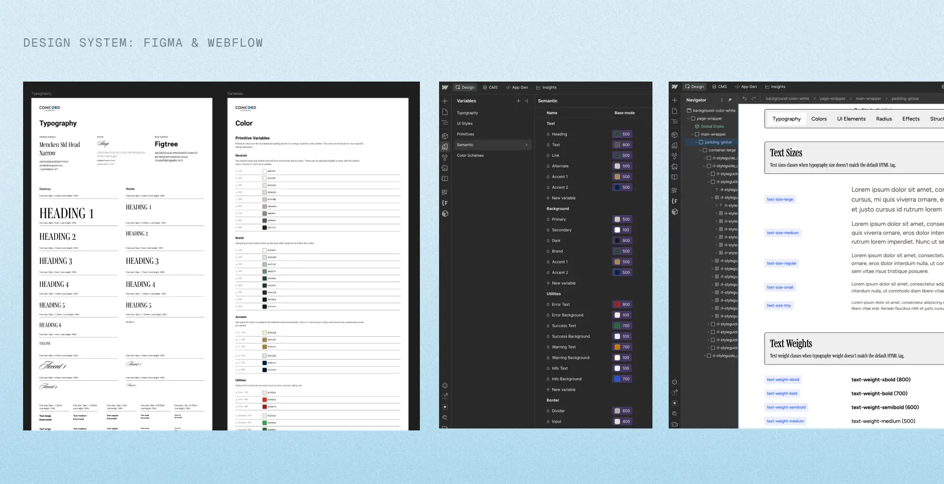
Systemized design to development workflows for efficiency
To ensure efficiency and scalablity, I established a reusable component system based on Webflow and Relume. I recommended to use the Client-First Framework for all of our Webflow projects and Relume to streamline our workflows, ensure consistency across designers and for easier maintenance. Additionally, all of our Figma files are structured to mirror Webflow variables (typography, spacking, tokens).
This resulted in:
- Faster development cycles
- Fewer inconsistencies between design and build
- Easier iteration and future scalability
Validating the direction
While development was ongoing for other components, I built quick prototypes in v0.dev and ran usability sessions with clients that tested both directions (accordion vs separate tables).
Key Findings
Users preferred separated tables for clarity and navigation
Users struggled to understand document grouping in the accordion layout
Clear labelling of "Before Main Agreement", "Main Agreement" and "Standalone" reduced confusion
Users commented higher confidence in knowing what to send and when
75% of users completed the updated flow without assistance
Impact & Reflections
Key metrics for success
Following the redesign, the website showed strong improvements in engagement and user navigation, indicating a more intuitive and compelling experience.
Average session duration increased by 26% ↑
This suggests users are spending more time navigating the website.
Homepage dropoff reduced by 28% ↓
This indicates that users were more successfully guided into exploring further.
Reflection
This project required navigating ambiguity across branding, stakeholder alignment, and technical execution. By creating clarity through rapid prototyping, structured systems, and tangible outputs, I was able to move the project forward while reducing risk and accelerating decisions.